How to Customize Your AI Chatbot Widget to Match Your Brand
Updated September 3, 2026 · 6 min read
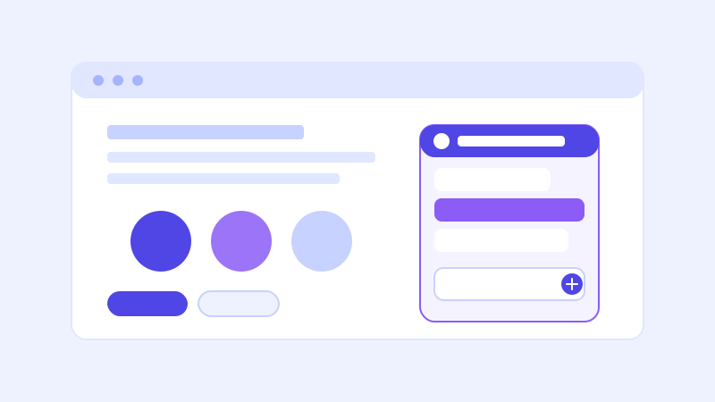
A visitor decides whether a chatbot belongs on your site within about a second of it opening, and most of that judgment has nothing to do with how well the bot actually answers. A default-looking widget, the vendor's stock accent color, a generic robot icon, a greeting that reads like it was written for any business rather than yours, signals "third-party tool" before a single message is exchanged. That signal costs you engagement even when the underlying answers are good, because a visitor who assumes a tool is generic is less inclined to trust what it tells them.
Why visual fit actually affects whether people use it
This isn't purely aesthetic. A widget that looks like part of your site reads as an extension of your team, while one that looks like a bolted-on plugin reads as a lower-effort substitute for actually talking to someone. The gap in how much visitors engage with an on-brand, thoughtfully worded widget versus a stock one is large enough that it's worth treating widget customization as part of setup, not an optional polish step to get to eventually.
The settings that matter most
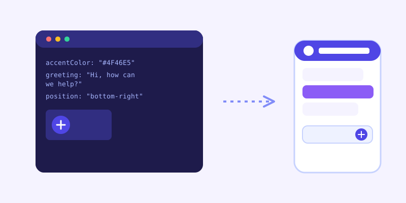
Accent color. Match your primary brand color, not just something that looks fine in isolation. A widget in an unrelated color, even a pleasant one, is the fastest visual tell that it wasn't actually set up for your site specifically.
Logo or avatar. A small logo or brand mark in the widget header does more to establish legitimacy than almost any other single setting, since it's the first thing a visitor sees before reading a single word.
Greeting message. The default greeting on most chatbot tools is some version of "Hi, how can I help you today?" which is fine but generic. Rewriting it to reference your actual business, "Ask me anything about our pricing or how shipping works," gives a visitor a concrete reason to type something instead of closing the widget.
Position and launcher style. Bottom-right is the near-universal convention for a reason, visitors expect it there, but the launcher icon itself (a chat bubble, your logo mark, a custom icon) is worth setting deliberately rather than leaving on a generic default that doesn't match anything else on your site.
Widget name. Some tools let you label the widget itself, "Support," your product name, or a more personal name. Match whatever tone the rest of your site uses. A playful consumer brand and a formal B2B firm shouldn't necessarily use the same label just because it was the default.
What's worth spending real time on, and what isn't
Getting the accent color, logo, and greeting right takes a few minutes and covers most of the visual-fit gap. Beyond that, diminishing returns set in fast. Chasing pixel-perfect custom animations or a heavily reworked chat bubble shape is time that would do more good spent checking whether your pricing and FAQ pages actually have complete answers on them, since a beautifully styled widget still fails the moment it can't answer a real question. Style earns first impressions. Content earns the rest of the conversation.
A common mistake: matching the wrong thing
It's easy to match a widget's color to a logo file and call it done, but the more useful reference point is the specific page a visitor is likely to be on when they open it, often a pricing or product page. If your site uses a slightly different accent shade in different sections, or your logo's exact color doesn't read well as a chat bubble background, it's worth adjusting for legibility and contrast rather than forcing an exact hex match that looks worse in practice than a close approximation.
Checking it actually looks right before you call it done
Preview the widget on both a light and a dark section of your site if you have both, since a color that looks great over a white background can lose contrast against a dark hero section. Check it on mobile specifically, since a launcher or greeting bubble that looks proportionate on a desktop screen can crowd a small screen or overlap other fixed elements like a cookie banner or a sticky header. And read the greeting out loud once: text that looks fine written down sometimes reads oddly stiff or oddly casual once you actually hear the tone.
The bar to clear
None of this requires design skills beyond picking a color that matches what's already on your site and writing one sentence in your own voice instead of the tool's default. The goal isn't a widget indistinguishable from custom-built software, it's a widget that doesn't announce itself as a stock plugin before it's answered a single question. Most of that gap closes with three settings: the right color, a real logo, and a greeting that mentions your actual business by name.
Frequently asked questions
Does customizing a chatbot widget's appearance actually affect how many visitors use it?
Yes. A widget styled to match your brand, correct accent color, your logo, a greeting written for your actual business, reads as part of your site rather than a bolted-on third-party tool, and visitors engage more readily with something that looks like it was built for them specifically rather than a generic default.
What chatbot widget settings should I customize first?
Start with accent color, logo or avatar, and the greeting message. Those three settings cover most of the visual-fit gap in a few minutes. Position, launcher icon, and widget name are worth setting deliberately too, but they matter less than getting the first three right.
Should I spend a lot of time perfecting the chatbot widget's design?
Not beyond the basics. Getting color, logo, and greeting right closes most of the gap quickly, and time spent beyond that has diminishing returns compared to making sure your site's actual content, pricing, FAQ, policies, is complete enough for the bot to answer well once someone opens it.
How do I check that a customized widget looks right across my whole site?
Preview it on both light and dark sections of your site if you have both, since contrast can look fine in one area and poor in another. Check it on mobile specifically for overlap with other fixed elements like a header or cookie banner, and read the greeting text out loud to catch a tone that reads stiffer or more casual than intended.
More articles
 Guides
How to Add an AI Chatbot to Your Website Without Code (2026 Guide)
A step-by-step walkthrough for adding a real AI chatbot to your website in minutes, no flow builder and no code required, plus exact install steps for WordPress, Shopify, Wix, and Squarespace.
Read article → Product & AI
Why Your Website Chatbot Keeps Saying "I'm Not Sure" (And How to Fix It)
Most AI chatbots answer from a snapshot of your site taken whenever they were last trained. Here's why that causes constant "I'm not sure" replies, and what a chatbot that checks live instead actually looks like.
Read article →